Rebrand · Secure Power Solutions
One icon, assembled from its parts.
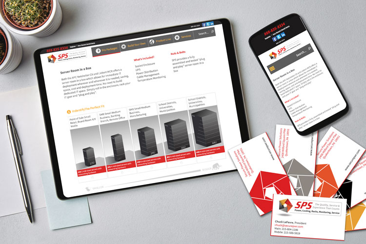
A complete rebrand for Secure Power Solutions: new logo, website, sell-sheets, and support materials, built around services that work alone or bundled together.
The goal
A complete rebranding, taking in a new logo, website, sell-sheets, and customer support materials.
The approach
Secure Power Solutions services work well together and stand up on their own, and their packages are available as parts or bundles. So the logo shows a single icon made of parts, and the website and marketing materials reuse the same symbols and logic.
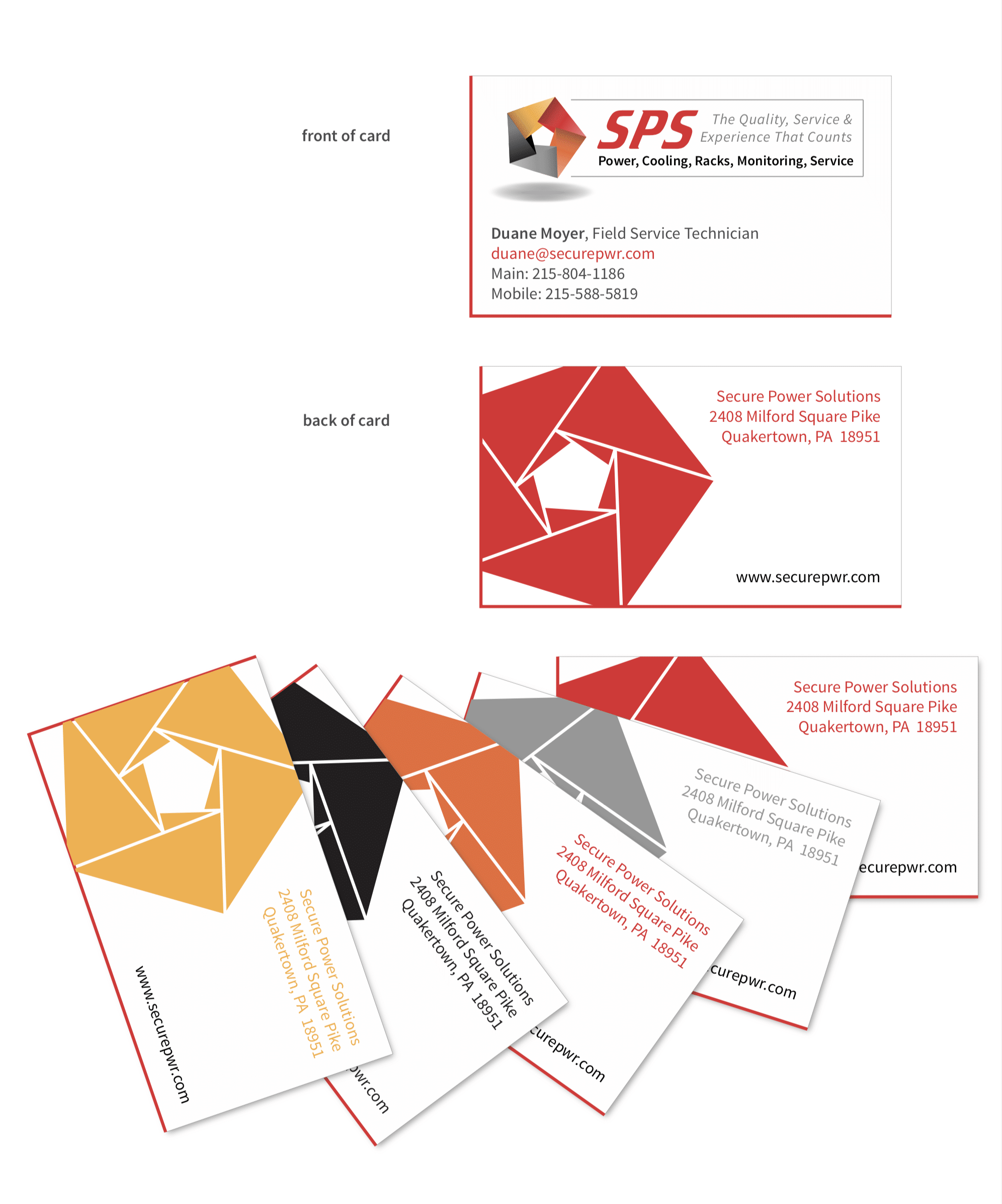
Cards you choose
The business cards let a prospective client pick a color. We developed this after learning how memory works: an emotional response makes an experience easier to recall, so offering a choice of colors makes the handover a personal decision rather than a transaction. It has since proved successful for other clients too. A red edge helps the card stand out from the rest of the stack.